Information and way-finding design is a form of design that entirely relies on a function, whether being to navigate or to inform. Wayfinding design is the process of organising spacial and environmental information to help users find their way. Information graphics are visual representations of information, data or knowledge.
Examples of Information & Way-Finding Design:
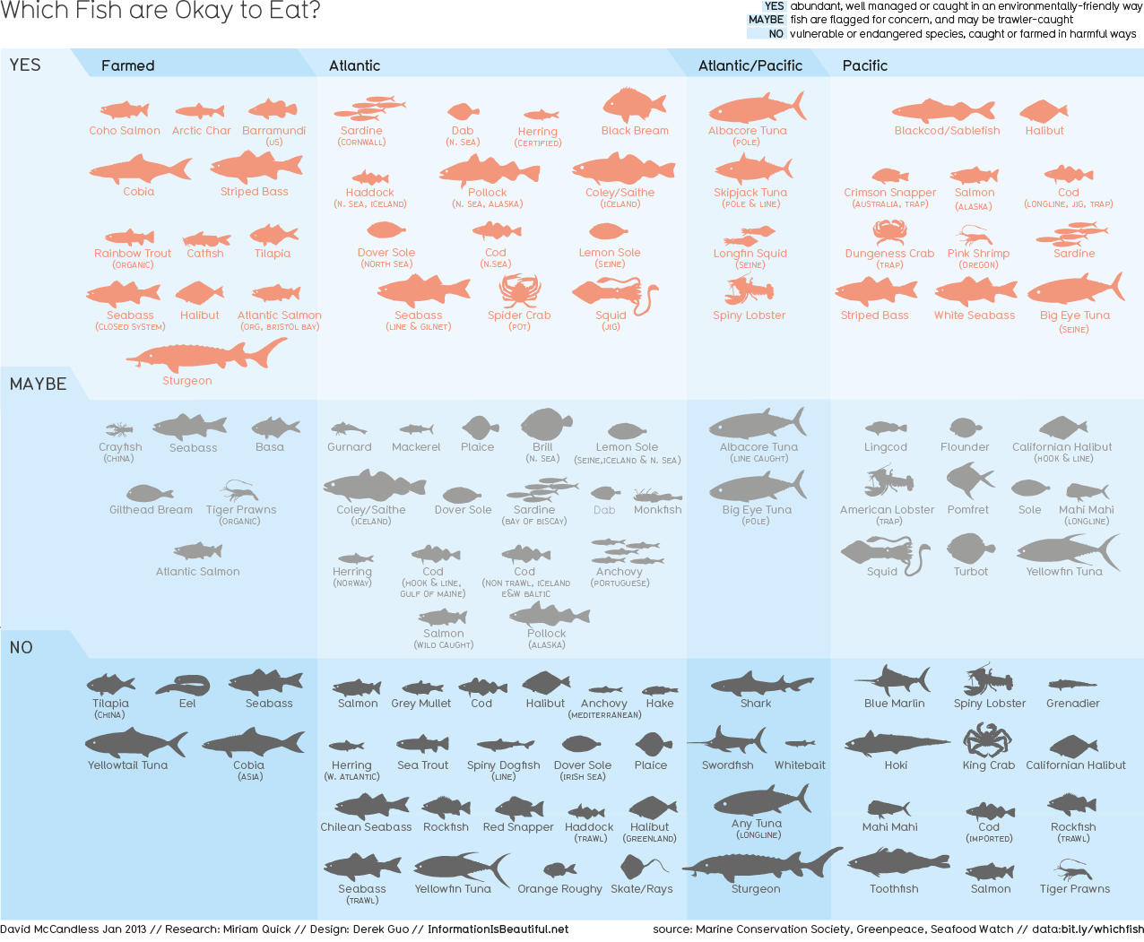
1. Information Is Beautiful: Which Fish Are Okay To Eat Infographic
Genre: Information, pictograms
Content: Information about which types of fish you can eat and which ones you can't due to how endangered the fish are, with images and text to help you understand and determine which fish fall under which category
Audience: Fish eaters, environmentalists, general public
Functions: To inform the reader on how many fish are becoming endangered due to overconsumption
Format: Infographics
2. Holmes Wood Design: Paddington Recreation Ground Map
Genre: Information, maps, way-finding
Content: Information about the Paddington Recreation Ground in the City of Westminster
Audience: General public, users of the recreation ground
Functions: To inform the reader of where to find certain facilities around the recreation ground, and help them to get around if they are lost
Format: Map, Signage, Infographics
3. Infosthetics: Visualising The Transfer Market of Europe's Top Football Leagues
Genre: Information, football, online data
Content: All of the transfers throughout Europe's top football leagues
Audience: Football fanatics, footballers, internet goers
Functions:
To inform the reader of the clubs which are loosing players, and those who are acquiring them. Also allows the viewer to find out how much each club spends on their team, etc
Format: Infographics, web based
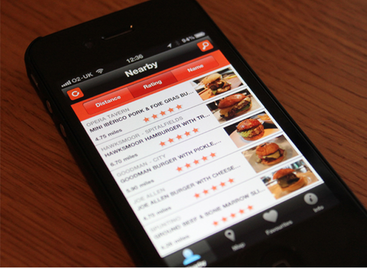
4. Applied Design: Dublin Bus Transport Information
Genre: Information, maps, way-finding, signage, diagrams
Content: Network diagram featuring bus stops, terminal areas and city zones
Audience: City dwellers, transport takers, commuters, citizens, general public
Functions: To inform the reader of the whereabouts of each city bus stop and station around Dublin, as well as times of buses and ability to get to know of changes and traffic issues by ringing or texting the numbers provided with the maps
Format: Infographics, maps, signage, "London-Underground Tube Map" style
5. Applied Design: UK Border Visibility
Genre: Information, pictograms, identity
Content: Infographic pictograms providing clear seperation between the identity of the port operator and the immigration environment
Audience: Immigrants, citizens, travellors, holiday goers
Functions: To increase awareness and visibility of the border process, with uninformed immigration officers and improved information at the ports of entry
Format: Infographics, signage, posters, information walls
6.
Biesek Design: Zion National Park Wayfinding
Genre: Information, pictograms, way-finding
Content: Infographic pictograms providing guidance and understanding of where important facilities are in the park
Audience: Tourists, visitors, park attendants
Functions: To inform visitors of where they can find certain facilities through understandable and coherent signage
Format: Infographics, signage
7.
Information Is Beautiful: Rhetological Fallacies
Genre: Information, pictograms, collection
Content: A brain-blending categorisation and visualisation of errors and manipulations of rhetoric and logical thinking
Audience: The general public
Functions: To elucidate and name a few of the most common fallacies to show the reader bad habits that are involved in their own though processes and decision making, in order to entertain and educate
Format: Infographics, leaflet
8. Applied Design: Bristol Legible City
Genre: Information, signage, way-finding
Content: Public information on signage with directions of the way in which you should travel to get to certain points of interests or facilities around Bristol City
Audience: City dwellers, busy public, tourists, general public
Functions: To enhance people's understanding and experience of the city, and to help the public navigate around the busy urban area
Format: Infographics, signage, typography
9. Infosthetics: Comparing The World's Richest People
Genre: Information, website, comparison
Content: A daily updated interactive dashboard of the world's richest people
Audience: The general public, internet users
Functions: To inform the public of all sorts of different life changes and money changes happening with the world's richest people. Also the opportunity to explore the historical rankings of the last 10 months if so wished
Format: Website, infographics, collection of information
10. Infosthetics: Handsome Atlas
Genre: Information, education, atlas
Content: Data visualisations literally about everything in America for example lumber, liquor, malaria, insanity, Irishmen, etc collected after the Civil War
Audience: General public, historians, data collectors, students
Functions: To inform and educate the reader/viewer on all the information, pie charts, maps, graphs etc that were collected after the Civil War and how much America has been impacted by the slightest of things, whether it being immigrants or trees planted
Format: Infographics, maps, pie charts, graphs, statistics
✿✿✿✿✿✿✿✿✿✿✿✿✿✿✿✿✿✿✿✿✿✿✿✿✿✿✿✿✿✿✿✿✿✿✿✿✿✿✿✿✿✿✿✿✿✿✿✿✿✿✿✿✿✿✿✿✿✿✿✿
5 Examples of websites/blogs that will help you to define product & packaging design:
The Definition:
The way in which any product is packaged and how the design looks when the product is sold within this packaging. The packaging usually reflects the product that's inside of it, and can often be extremely creative and unique.
Examples of Product & Packaging Design:
1. Release The Chicken: Jungle Fruits
Genre: Promotion, packaging
Content: 4 Packaging variations for Jungle Fruits juice drinks
Audience: General public, juice consumers, kids
Functions: To sell a brand of juice drinks through the idea of "tasting the rainforest"
Format: Plastic, maleable packaging
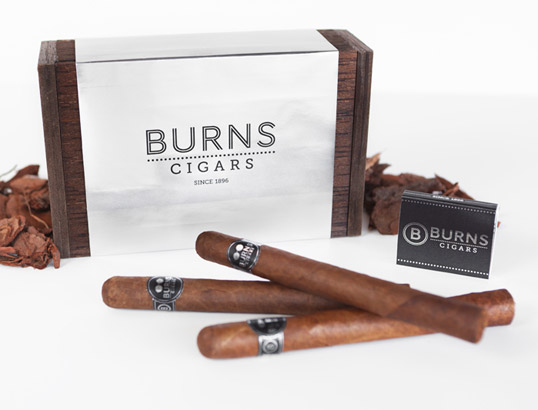
2. Lovely Package: Burns Cigars
Genre: Promotion, packaging
Content: Box packaging to hold a set of cigars, holding American humour and wit due to the cigar set being named after George Burns, who never performed without a cigar in hand
Audience: Men in their late twenties and upwards, smokers, and those who can appreciate and respect good quality execution and cigars
Functions: To sell a cigar brand, through American humour and wit
Format: Wood, aluminium, cigars
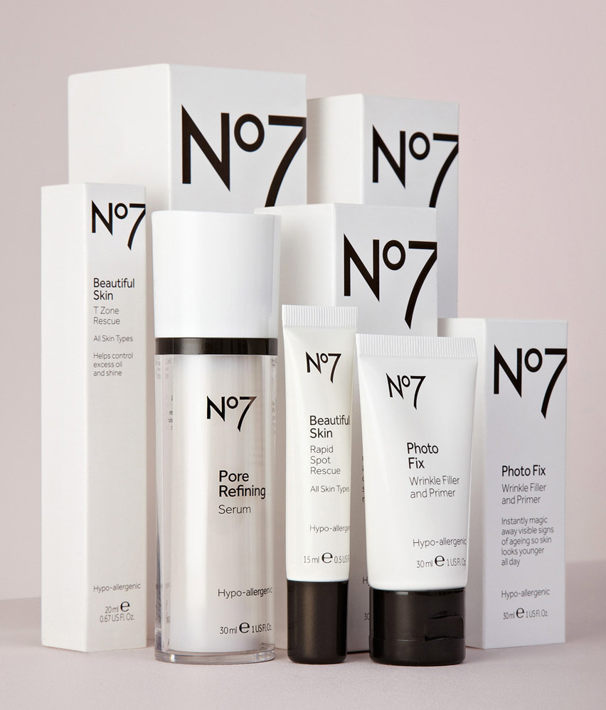
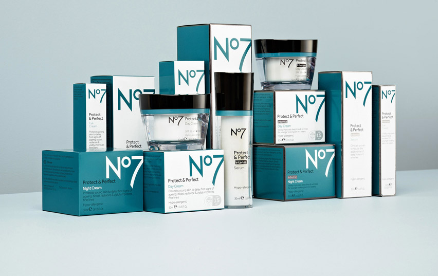
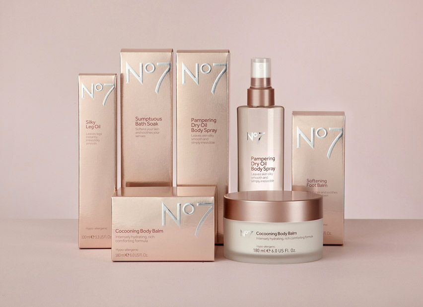
3. Lovely Package: No7
Genre: Promotion, packaging
Content: Variations on the No7 packaging, following different colours and materials to suit the products being packaged
Audience: Girls and women of all ages, worldwide consumers
Functions: Different sets of packaging created to modernise the No7 packaging and make it more sellable to worldwide buyers and consumers of different ages and classes
Format: Card, plastic, embossing and glass packaging
4. The Dieline: CMYK Playing Cards
Genre: Promotion, packaging, advertising
Content: Pack of 54 cards, coloured by different opacities of CMYK ink
Audience: Graphic Design enthusiasts, print enthusiasts, poker players
Functions: A set of playing cards that a designer could refer to when printing their designs, as you can see what different opacities of cyan, magenta yellow or black look like when printed
Format: CMYK ink on card packaging
5. The Dieline: The Ladybug & Bee Collection
Genre: Promotion, packaging, advertising
Content: Box of salted caramel bees crafted by hand
Audience: Children, women, bee enthusiasts
Functions: To advertise and sell a box of salted caramel bees, as well as educating the consumer with a new fact every time they eat a bee
Format: Card, salted caramel sweets, packaging
6. Burgopak: BERG Little Printer
Genre: Promotion, packaging
Content: Packaging box for a little printer that prints out small bits of information relating to your social needs, news articles and puzzles in the form of a small newspaper
Audience: Young adults and upwards, students, designers
Functions: To form a relationship between person and product, through encapsulating charm and character within the design to sell the product
Format: Card, box packaging
7. I Can Be Creative: Jooze
Genre: Promotion, packaging
Content: A set of juice boxes shaped like slices of fruit that can stand up on different edges of the carton
Audience: Children, teenagers, adults that like juice
Functions: To sell a fun and inventive form of packaging that immediately makes the thought of drinking the juice more enjoyable and entertaining
Format: Card, straws, box packaging
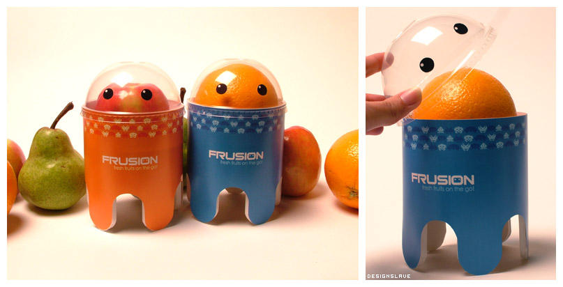
8. I Can Be Creative: Frusion
Genre: Promotion, packaging
Content: Packaging series of apples, oranges and pears created to look like aliens
Audience: Children, particularly boys
Functions: To create a way of packaging fruit that is both entertaining and child friendly and then to be sold to parents for their children in lunch boxes
Format: Frappucino covers, cardboard, mounting board, foam board, plastic, packaging
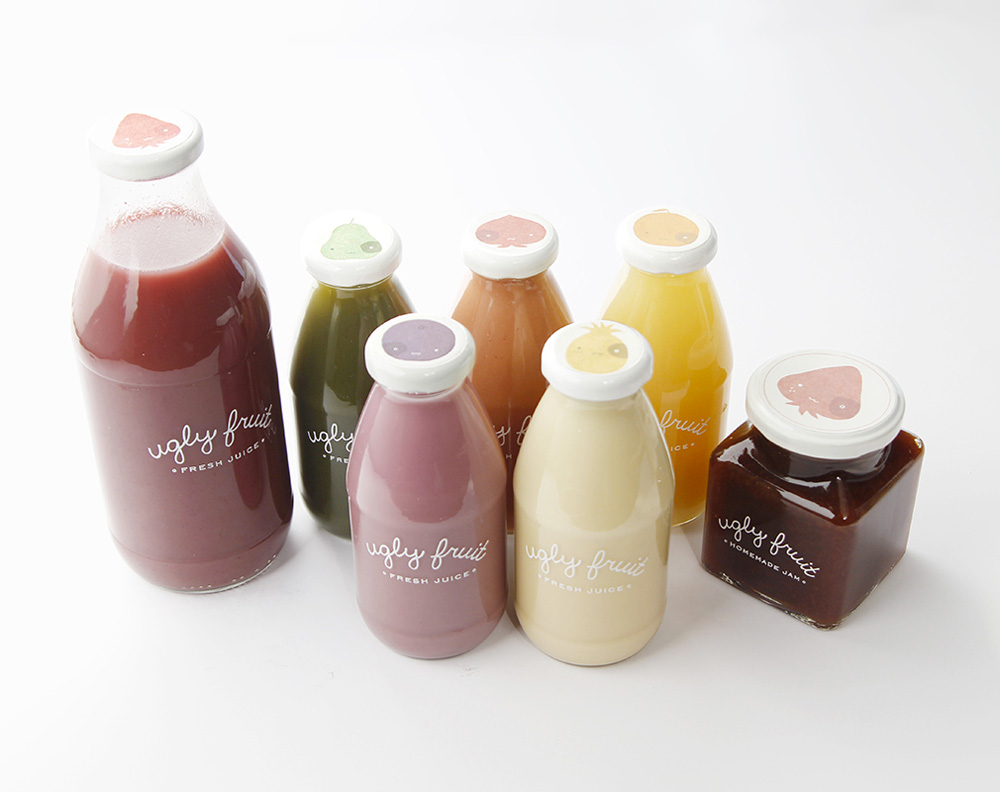
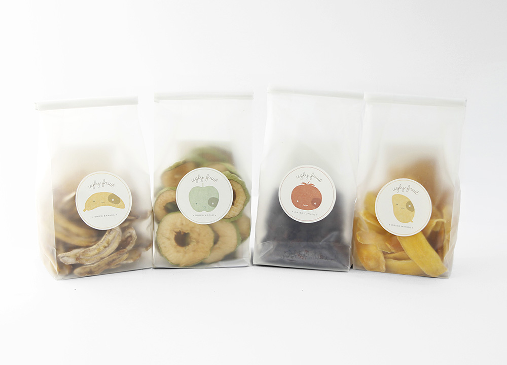
9. Lovely Package: Mirim Seo Student Work
Genre: Promotion, packaging
Content: Packaging a series of food products, mainly fruit
Audience: Possibly women more than men, as the designs are sweet and quite girly. But could easily be sold to children or older ages
Functions: To create a delicate form of packaging that makes note of how much fruit and vegetables are wasted each year, because they don't look perfect or are bruised, when really they taste just as great. Task is to make that ugly fruit look pretty again!
Format: Glass / plastic bottles and tubs with fruit blended inside them and little eco friendly bags of dried fruits
10. The Dieline: Vogue Limited Edition Box
Genre: Promotion, packaging, editorial, fashion
Content: Limited edition box set of Vogue magazine, comes signed and beautifully crafted
Audience: Women and designers, and readers of Vogue
Functions: To package a limited edition of a Vogue mag, in a way that makes the magazine seem expensive, unique and like no other magazine before!
Format: Embossed white box with tracing paper protection around the limited edition magazine. Also comes inside an expensive pink designer bag.
✿✿✿✿✿✿✿✿✿✿✿✿✿✿✿✿✿✿✿✿✿✿✿✿✿✿✿✿✿✿✿✿✿✿✿✿✿✿✿✿✿✿✿✿✿✿✿✿✿✿✿✿✿✿✿✿✿✿✿✿
5 Examples of websites/blogs that will help you to define branding & identity:
Logo Design Love
Designspiration
Logobird
Behance
Retail Design Blog
The Definition:
The visible elements of a brand (such as colors, design, logotype, name, symbol) that together identify and distinguish the brand in the consumers' mind.
Examples of Branding & Identity:
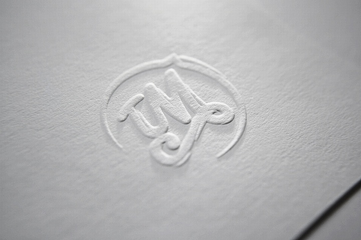
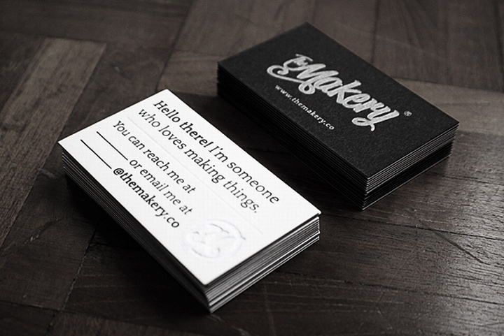
1. Retail Design Blog: The Makery Branding
Genre: Promotion, branding, self promo
Content: Set of self promotional items designed for The Makery (a creative consultancy) - items like business cards, letters about themselves and posters
Audience: Designers and people who appreciate good design - also clients looking for craftsmen
Functions: To produce a brand identity for a creative consultancy who specialise on hand-crafted models, installation design and art direction
Format: Embossed and screen printed designs, wax imprints or signatures and stickers
2. Logo Design Love: Nexcite Logo
Genre: Promotion, branding, logo
Content:A rabbit logo produced for an endurance drinks company called Nexcite
Audience: People who take part in endurance activities, such as running. Or even just those who like the drink itself, or need a bit of extra energy
Functions: To produce a friendly identity that helps bring across the idea of the company - the fact that the drink will keep you running for miles like a rabbit, whilst keeping your heart happy
Format: Black and white simple logo that can have the colours changed accordingly. I noticed on Nexcite's website, that they have actually changed the colour to red on their packaging
3. Behance: Monica
Genre: Promotion, branding, logo, fashion and retail
Content: A series of items created to help brand a retail store called Monica. A logo was produced, which was then applied accordingly to hangers, signage, business cards etc
Audience: Fashionistas, women who like that sort of attire, designers
Functions: To produce a brand identity that reflects their passion for fashion, as well as their formal approach and elegance in their clothing lines
Format: Monochrome image and text logo applied to colourful floral patterns on labels, business cards, website etc. Logo has also been applied to the signage outside the store, and the clothes hangers in store
4. Designspiration: Flour Pot
Genre: Promotion, branding, food, cafe
Content: Menus, business cards and sandwich bags all created with the same friendly and informative style
Audience: Consumers, food enthusiasts, the general public
Functions: To produce a friendly identity that encourages the general public to choose that cafe/sandwich shop over any other, and trust in their food and what they are selling
Format: Typographic informative layouts using a friendly almost hand written typeface, written/printed onto thin stock and menus
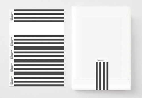
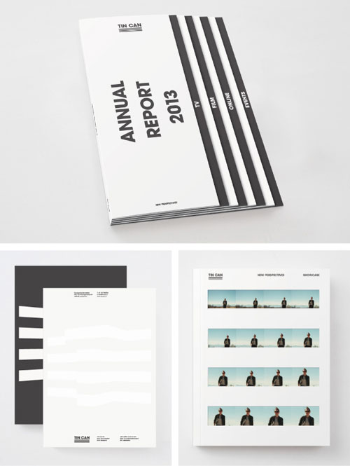
5. Logo Design Love: Tin Can
Genre: Promotion, branding
Content: Business cards, letter heads, magazines, websites and interior design
Audience: Clients, general public, people working in television
Functions: To produce a consistent identity across the brand to reflect their design practice
Format: They have literally covered everything - from business cards to the interior design of their studios!
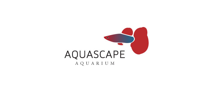
6. Logobird: Aquascape Aquarium
Genre: Promotion, branding, logo
Content: Logo for Aquascape Aquarium
Audience: Fish buyers, general public, aquarium goers
Functions: To produce a friendly and recognisable logo for the aquarium
Format: 3+ colour logo, not sure how many colours. But uses both typography and image to covey the message
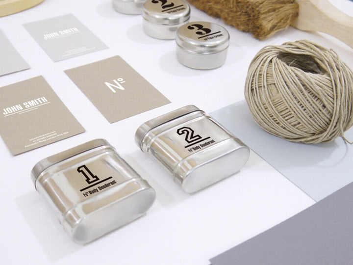
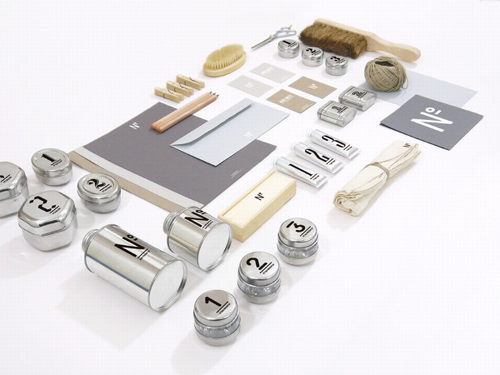
7. Retail Design Blog: No. Men's Skin Care
Genre: Promotion, branding, logo, healthy and beauty
Content: Branding for No. skin care for men, includes business cards, containers for moisturisers and things, website, logo variations, etc
Audience: Men who want to look after their skin for an affordable price
Functions: To convince men to choose their skin care options over other skin care brands, by making a cheaper brand seem quite expensive, modern and young
Format: Pastel colours, clear and simple. Possibly screen printed examples of the work onto business cards etc, and website design
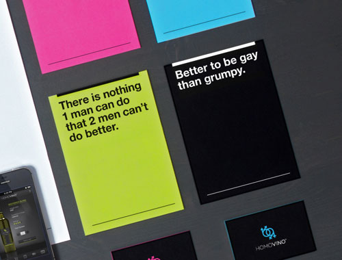
8. Logo Design Love: Homovino
Genre: Promotion, branding
Content: Branding for Homovino - a wine company raising money for marriage quality
Audience: Homosexuals, people who encourage marriage equality
Functions: To encourage the general public that homosexuals deserve the right to marry as much as anyone else, and do this by selling products and giving themselves a suitable branding appearance
Format: Bright, neon, quite girly colours printed onto business cards, bottles, posters, etc
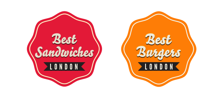
9. Logobird: Best Sandwiches & Burgers, London
Genre: Promotion, branding, app design
Content: Branding and promotion for a sandwich and burger shop in London
Audience: Hungry people, sandwich and burger enthusiasts
Functions: To encourage the general public to buy sandwiches and burgers at this sandwich shop, rather than anywhere else through a friendly and welcoming logo
Format: Bright, vintage and welcoming logo as well as an app reviewing how great the burgers and sandwiches are at their shop
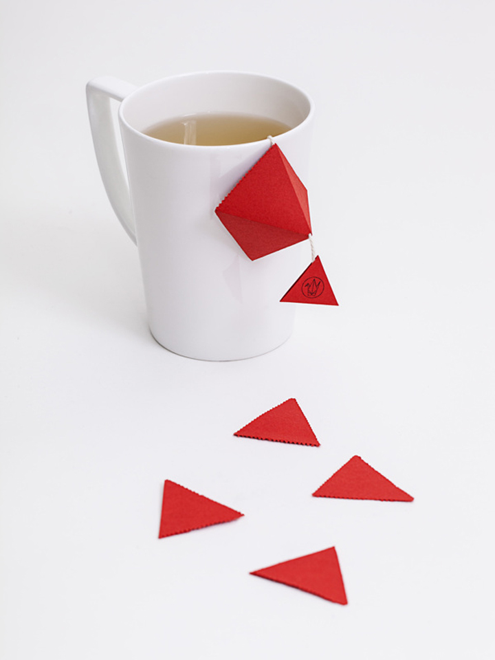
10. Retail Design Blog: Senba Teabags
Genre: Promotion, branding, packaging
Content: Branding and packaging for Senba teabags - taken in quite an oriental approach to reflect the country of origin
Audience: Tea enthusiasts, oriental people
Functions: To educate the general public on the oriental side of tea, as well as promoting the difference in flavour. Also encourages the viewer to buy this product, due to the exciting and unique packaging choices
Format: Bright, red (reflecting China) origami teabag packaging, with a simple origami logo
✿✿✿✿✿✿✿✿✿✿✿✿✿✿✿✿✿✿✿✿✿✿✿✿✿✿✿✿✿✿✿✿✿✿✿✿✿✿✿✿✿✿✿✿✿✿✿✿✿✿✿✿✿✿✿✿✿✿✿✿
5 Examples of websites/blogs that will help you to define editorial and publishing design:
Editorial Design creates, define and redesign the layout for books, magazines, newspaper or any kind of editorial pieces that have as a target the communication. Each piece should be designed under the aesthetics and functionality rules.
Examples of Editorial & Publishing Design:
1. Editorial Design Served: Open & Bloot
Genre: Publishing, book design, editorial
Content: A book designed in Germany - not sure what the book is about, as the description is in German and the contents are German, but it is extremely aesthetically appealing!
Audience: Lovers of good design, Germans, Book collectors/enthusiasts
Functions: To educate the reader on the chosen subject, as well as making the book look fantastic
Format: Clean, professional, well chosen colours with an embossed fabric front cover and CD slots at the back
2. Editorial Design Served: Circular Magazine Supplement
Genre: Publishing, editorial, zine style
Content: A set of 3 magazines designed for D&AD, each edition dedicated to a designer of choice
Audience: Designers, D&AD goers
Functions: To educate the reader on the 3 designers of choice through the aesthetics and information displayed within the magazines
Format: Clear and functional magazines in a zine style format.
3. Editorial Design Served: Post Magazine N.2
Genre: Publishing, book design, editorial
Content: A set books. Not completely sure as to what the content is reflecting, as of the language barrier once again, however the layout of the pages caught my eye
Audience: Designers, those interested in the content who can speak the language
Functions: To educate the reader on said subject chosen
Format: Extremely clear grids and layout choices, with easy to read sans serif typefaces, printed onto interesting stock choices
4. Creattica: Kiwi
Genre: Publishing, catalogue, photography
Content: A catalogue design for Kiwi - a versatile furniture company. Book consists of different choices of furniture and photographs of said furniture
Audience: Home owners, furniture collectors, catalogue lovers
Functions: To inform the reader on the collection of furniture that Kiwi have to offer and why you should choose them over other furniture sellers
Format: Clean, simple and concise structure and layout throughout the book, with various professional photographs of the furniture available
5. Creattica: Festivais Gil Vicente
Genre: Publishing, editorial, magazine
Content: A magazine designed for Festivais Gil Vicente art&design festival
Audience: People interested in going to the art festival and the content of the magazine
Functions: To encourage the reader to go to the festival
Format: Aesthetically pleasing, modernistic approach to magazine layout
6. The Design Surgery: Upstreet Magazine
Genre: Publishing, editorial, magazine
Content: A magazine containing information on men's high end arts, culture and lifestyle
Audience: Men interested in high end community
Functions: To inform the reader on things that men would find interesting
Format: Consistent design layout throughout the magazine - particular use of lines down the pages
7.