What is Graphic Design? What does it mean to you?
Graphic design is appropriate, creative, obsessive, frustrating, organised, structured, ongoing...
Although all Graphic Design is different, there are a basic set of questions that most successful designers ask themselves when creating work:
- hand drawn and / or digital?
- think about the language / dialogue
- personal opinions of the designer
- information and how you communicate it
- think about the scale / space / format
- think about your media, it doesn't just have to be print based
- what can be created successfully in the time frame?
- think about colour
- think about structure / organisation
- image and /or type? image as type /type as image?
- Function
- Design Context
- Scale
- Tone of Voice
- Message
Then, in groups, we wrote down lists of what main traits of designs we considered to fall under these categories, IE;
Function: what is it doing? why does it exist?
to inform, decorate, instruct, promote, educate, warn, advertise, explain, entertain, inspire, express, present
Context: who is the target audience? what is it?
- branding, publishing, campaigning, advertising...
- time or era
- audience
- class
- gender
- style
Tone of Voice: how does it suit the target audience?
informal, playful, chatty, comical, powerful, inspirational, proud, simplistic, witty, serious, satirical, angry
Message/Ideas/Concept: what is it trying to say?
awareness, decorative, political
Intended Scale: what is its intended size? is it effectively applied?
billboard, poster, side of building, Ad shell, side of bus, magazine, TV, web
Using this list, here are some examples of design that fall under each category:
FUNCTION


Function = To Inform

Function = To Decorate

Function = To Promote

Function = To Advertise
CONTEXT

Context = Time/Era


Context = Gender


Content = Class
TONE OF VOICE

Tone of voice = Playful/silly

Tone of voice = formal/serious

Tone of voice = friendly
CONCEPT

Concept = relates to company cleverly
Concept = witty/silly

Concept = working with negative space
INTENDED SCALE


Scale = large scale format - intended to work on interior spaces of buildings

Scale - small scale format, intended for smaller use in packaging

Scale = very large, intended to be seen from far away and to catch your eye

In today's group crit we presented our typefaces so far to Amber, Simon and a group of 5 classmates. From the group crit I have taken away the following feedback:
- Try combining the typeface I created based on The Little Mermaid with the stripes for my final idea, and see what this looks like. The swirly parts on the M are really nice and could look really aesthetically pleasing with the other typeface.
- Try creating your typeface at different sizes, because the overall affect will change when it's used in different sizes - will the weight on the lines stay the same?
- Print off Arial and actually work from that typeface so that your letters are consistent and accurate. This will also relate to Anisha more as her favourite font is Arial.
- Leave your comment • Category: alphabetsoup, OUGD403
- Share on Twitter, Facebook, Delicious, Digg, Reddit
STUDY TASK 2
Using the online resources that you have been introduced to in the lecture studio workshop and with reference to the quotes used in the 'What is Graphic Design - Part 1' Presentation; source, present and blog examples of current design practice that reflect your creative interests. Choose 5 criteria from the list below that will guide your selection of work
- Creative use of type
- Visual quality
- Tone of voice
- Attention to detail
- Simplicity of design
- Meaning / message
- Audience engagement / interaction
- Style / aesthetic quality
- Use of media & method of production
- Relationship between form & format
- Interest in the content
- Use / choice of language
- Structure & layout
Creative use of Type Examples

Source For Image
I really like this idea and think that it's really creative and effective. The typeface works really well and the logo looks just like a bison, which I suppose was the intention. I really like type when it's used to create an image.

I think that the idea of creating letter-forms out of sweets is a really good idea and is interesting to look at. The type grabs your attention with the colours and the letters are really bold, especially against the plain background. I like how experimental the idea is and how the designer wasn't afraid to use alternative materials, making the end result even more effective.
 Source For Image
I like this idea, because it's inventive and fun. I think it's smart how the designer thought to make the entire image looks festive and like a Christmas tree. I also love how the type and the design has been made out of lots of circles which have been designed in a way to make them look like fairy lights. The fact that the fairy lights also look like they're glowing, due to different tones of colour, makes the design even more effective.

I think that this idea for a book cover is effective and witty. I love how the designer chose a font with serifs so that they could make the letter A look like the Eiffel Tower, which is a really interesting and clever concept. I love how minimalist the whole design is and how it has literally been created with a really simple and legible typeface.

Source For Image
I love this idea and I think it's really funny and inventive. I love how the images have been made out of letters, numbers & punctuation and how you can still recognize the characters being portrayed. I really love how simplistic the concept is how well it has been executed.
Simplicity of Design

Source For Image
I think this idea is really witty and legible. I like how simple and minimalistic the design is, yet how well the message is conveyed. The idea is quite controversial in a way, but still extremely amusing.
 Source For Image
I adore minimalistic Graphic Design work, because it proves that you don't need a really busy and filled design to convey a message well ("less is more"). Even though there isn't a lot of detail in the design, the attention to detail is still amazing.

Source For Image
I really like this concept as it's quite an unusual thought yet it works extremely well. I love how when the animals join together, they produce another image of a jeep. I think it's a really clever idea and is aesthetically pleasing.

Source For Image
I like how this artist uses lines in different ways throughout his design work. I especially like the design on the far right as it looks as though the rain has moved out the way of the plane as it passes through the sky.

Source For Image
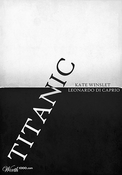
I really like this design, because I think it has a really clever concept behind it. I love how the designer has decided to make the word Titanic look as though it's sinking like the ship did, and how they did it up to a certain point to keep the aesthetics looking good. I also really like the idea of using black and white to represent the different social classes and fatality of the story.
Use of Media & Method of Production

Source For Image
I think this i a really interesting way of creating a letterform. I don't particularly like the end product, I just really like the fact the designer wasn't scared to use alternative media and production to create their final piece.

Source For Image
I chose this piece of design work, because it has been screen printed. I really enjoy screen printed work and think it makes the work more authentic and like one off pieces. I also quite like the colours and typefaces that have been used and think it's really aesthetically pleasing.

Source For Image
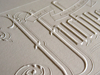
I really love embossed designs, they add texture and depth to images and make something, that may have just looked plain and monotone before, seem ten times more interesting just because it has been created with a different material process. I also really like the typeface used, because it's quite irregular and stretched out, which adds to the delicacy of the entire design.

Source For Image
Zim & Zou's Frame B
I chose this letterform, because I really like a lot of Zim & Zou's design work. I like the fact they decided to create a 3D letterform out of alternative materials, such as little pieces of coloured glass and sticks. I really like the idea and think that it's aesthetically pleasing and interesting to look at. I like the fact they only put a few coloured pieces of glass into the letter, as it gives the shape a minimalistic feel and makes it look quite fragile.

Source For Image
I really like this illustrative piece of design work. I like the fact the designer chose to print or draw onto tracing paper rather than your ordinary printing paper. The fact that they chose to put an interesting textured piece of paper behind the tracing paper adds to the design and brings a sense of depth to the image. I really like book binding and using different types of stock and media to create books, hence why I chose this design concept.
Interest in the Content

Source For Image
I think the idea behind these t-shirts is witty and very clever. The only problem would be that not everyone would get the humour behind the concept, as it only really relates to designers and artists or people that have heard of the D&AD Awards. I still really like the idea and the use of colour to relate to the original D&AD logo.

Source For Image
I really love this logo idea for Tsunami. I think it's really clever and well executed. I love the fact the designer decided to stretch out the letter S so that it looks like a big tsunami wave going over the rest of the word. It's a really simplistic yet effective concept, which makes it work better than if it was really detailed and more "wave-like".

Source For Image
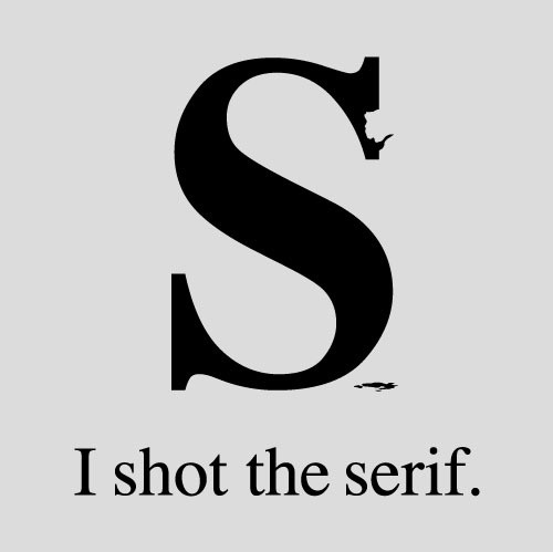
I've seen this idea reproduced quite often in lots of different ways, yet still think the idea is really witty and fun. It's quite a common graphic design joke, and probably wouldn't make much sense to someone that didn't know what a serif was. I think the part of the serif that was shout out could've been done a bit better so it looked more like it was shot, however I still really like it.

Source For Image
I really love this image and the concept behind it. I love the way the designer has made it look like the book has literally "blown their mind" by adding blood all over the image and hiding the head so that you don't actually know whether his head has been blown apart or not. I also really like the limited use of colour so that you are attracted straight to the blood and the writing on the white book. It's a really simple idea, but the content put into it makes it work extremely well.

Source For Image
I absolutely love barcode art and the ideas behind some of it. I really like this particular one, because of how well it has been executed and the way it actually looks like spaghetti is coming out of the barcode. I think it's a really interesting concept and adds interaction to packaging.
Meaning / Message

Source For Image
I really like this design piece, because the designer got really into the message and used the line concept throughout their design to help bring the message across of "where do you draw the line?". I think it's really clever and works really well as a design piece for this particular poster, however could look pretty weird out of context.

Source For Image
I really like these book cover designs, because of how simplistic they are yet they convey the message of things that happen in each story. I really love the idea of having little bits that come out of the book cover as it will attract the audience and help them engage with the book. I think it's a really clever and fun way of getting a message across.

Source For Image
I think this design idea is really clever and witty and well thought out. The fact they decided to use the underground map idea to convey what's under your skin in the human body is really interesting and makes the image more interactive. I think this conveys the information and message quite well and is aesthetically pleasing and easy to follow. I really like the concept behind the design.

Source For Image
I chose this piece of design work, because it looks hand-rendered and I like the light blue colour used in the background. I think the design conveys the message through the text in the middle and the fact they did a brain storm drawing in the background to help put the message across to the audience. I really like how the whole design isn't perfect and is a bit wobbly, which gives the image originality.

Source For Image
I really love how minimalistic this image is and how everyone will know exactly what they're trying to convey, as the original painting of 'the scream' is extremely recognisable and memorable. I'm not completely sure if there is a meaning behind the design, or whether it's just representing expressionism. Never the less, I really like the concept.


What
I thought about when approaching my designs and processes:
At first I wasn’t really sure where to go with
my designs, as the word dissect was a bit confusing and it was hard to think of
ideas that would work when hand rendered and in black and white. I decided to
look up the word in the dictionary and thesaurus for synonyms etc, which gave
me the idea of working with the structure of typography and the anatomy of the
human body. I also researched into illustrations from Gray’s Anatomy and I
looked for previous typefaces that were created with a similar concept to mine.
What
worked?
I think that quite a few of my final pieces
worked quite well, some stronger than others. The concept of the anatomy of
typography behind my designs was a strong idea and gave me quite a lot to work
with. I really enjoy working with different media, but decided to limit myself
to different types of ink and pencil. I think the use of biro and fine liner
helped create strong and detailed images, and using pencil to sketch out
certain proposals helped make the final results more accurate. I think the
letter T and H worked the best out of my designs, as I paid more attention to
those letters, because the ideas for them were hard to get around. I also think
they worked really well, because of the 3 dimensional look to them, which made
them look like an object that could be dissected.
What
didn’t work?
I think some of my ideas for my letterforms
failed to work properly. This may have been because I didn’t trace over any
real typefaces and drew everything freehand (my drawing skills aren’t really as
accurate so some of the letters looked pretty poor) but it could have also been
due to a terrible idea that I couldn’t convey! I think my worst two letters
were the R (which I didn’t like because it didn’t really represent dissect and
seemed rushed) and the I (which for me was a bit too cheesy and not really that
well thought out).
How
was the crit?
For
the crit everyone got into 3 groups and presented their ideas to each other in
their groups. The groups then chose 5 of the strongest images of every
designer’s typefaces and we then stuck these onto the wall and moved over onto
another table to look at other typefaces that were classed as the strongest
ones from another group. We were then told to single out the best 5 from all
the letters on the wall, which we had to explain our reason for choice to the
rest of the class. After this we were given some time to single out the single
best typeface created.
I think the way we went about criticizing the
work was good, because no one was singled out and told that their work was
really bad. I really enjoy having my work criticized and always love to find
out what other people think are my strong ideas. I think it was quite a good
idea to choose the strongest letterforms as it was a bit of an ego boost for
those chosen and helps you know whether your ideas are actually conveying the
right message or not. My letter H was picked for one of the top 5 of our group
and then chosen as the best design overall, which I’m really pleased with, even
though I felt like there were typefaces in my group that were much stronger in
quality and concept than mine was! I really enjoyed taking part in the
discussions of other people’s work in my group as it helps you to understand
each other’s thoughts and intentions, and everyone always has a completely
different opinion on each other’s work!


- Leave your comment • Category: alphabetsoup, OUGD403
- Share on Twitter, Facebook, Delicious, Digg, Reddit