- Leave your comment • Category: OUGD502, PPP2, studio brief 2
- Share on Twitter, Facebook, Delicious, Digg, Reddit


I was really pleased with my final outcomes for the self branding brief, as I felt as though they were a lot more professional than last year, and that I produced more work and focussed a bit more than I did last year.
It was interesting to see how my self promotional designs have changed over the year, and I know that next year I will be branding myself completely differently as my interests within design seem to be constantly changing and growing!
Although the branding didn't really reflect my craft skills as much as I would have hoped, I am still happy with the end result. I think that in the future I will need to manage my time a bit better, so that I can produce something really out of the box and unique, for example working with glass business cards like I originally had hoped!
- Leave your comment • Category: OUGD502, PPP2, studio brief 2
- Share on Twitter, Facebook, Delicious, Digg, Reddit

I really love the use of a pattern on one side of the business card as it adds colour to the design and makes it stand out! I also thought that the script lettering used is complimented by the bold colours and makes the designer seem friendly and creative.
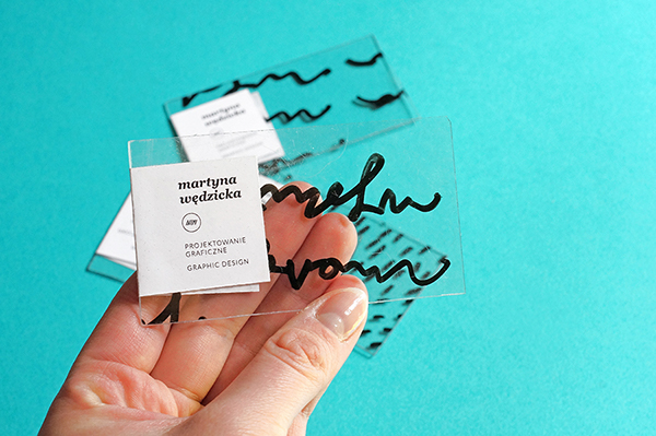
I loved this idea of drawing something onto some clear plastic / glass and then sticking the contact details onto the side using a sticker. I think that this could work really well for my branding, as I could sign paint some typography onto the glass and then put my contact details on the sticker, so that I don't have to worry about painting something small and detailed precisely.

Spray painting the edge of the business cards gives them a unique feel to them, as you introduce a splash of colour from the branding. Orange works really well as it's bright, bold and noticeable. This could also be done by producing duplex or triplex business cards using coloured stock.

I like the idea of packaging the creative CV in a way that makes it look like something you want to engage with and open - not just another cv arriving in the post that you'll throw away.

I also liked how when they photographed their products, they chose to photograph stationary items like pencils and tape, that reflected on the colours of the branding and helped to make a whole set of branded items, rather than just business stationery.

I think that the use of stamps could be really interesting, as you could take a set of plain cards out with you and your stamp, and whenever you want to give someone a business card, you could literally stamp it in front of them - this would be memorable and unique.
My Branding


Logo:
When it came to designing my logo, I wanted to create something that reflected my design style and hand-rendering abilities. I chose to work with my initials, as this could make a short and simple logo, rather than designing something overly complicated using my full name or making up a design name.
I produce the following logo by sketching out R and B using a script style typeface and joining them at the bowls and legs.

Business Card Mock-ups:

Stationary Mock-up:


Obviously the colour of the stock that I printed on will also effect the colour of the logo, so I played with off white and white stock too, before choosing to go with off white, textured stock.

Letterhead Design:
I thought about the different contents of my cv whilst progressing with my branding. One of the pages came to my mind when I was working on some other typography, so I quickly sketched out the idea and ended up using the original drawing within the creative cv!


I wasn't entirely pleased with this outcome, as I have hand-rendered a lot of things at a better quality, but it took so long that I wasn't that interested in starting again and trying to perfect it!
I haven't really used watercolour that much or even that much colour when I'm drawing type, as I'll usually trace over it in Illustrator if I want to add colour, so using water colour pencils made it really interesting and taught me quite a bit about using colour within my drawing designs.
I think that I have also learnt what works and what doesn't when it comes to using colours by hand.

I also drew out my logo for the front cover of my cv. I wanted the front cover to be simplistic, yet give a crafty feel to it, so I used a scalpel to cut the logo out. I decided against laser cutting my front cover, as this would have made it too precise and taken away from the aesthetic.


I was quite pleased with this outcome, as I've found that I'm not that bad at using a scalpel! Even though it could have been neater, I quite like the rough feel to it, as it shows that it was hand made.
CV Design:
(The order of the pages is a bit jumbled, so that it would print out in the correct order for the type of binding that I did!!)
Web Design:
I used Prosite on Behance to create my online presence. I haven't made the website live yet, as I want to wait until I can afford to pay monthly for the URL, but you could preview the website and see how it works so I took screenshots of the preview pages and made some mock-ups to show how my web presence would look..


I learnt quite a lot from this brief, as I haven't ever really self branded myself that a lot, or considered how I was going to promote myself to other people in a professional manner. Even though we had a similar brief last year, I didn't really take it as seriously as I hand't really ever done that much branding before then. But over this year I have learnt about branding and so I knew how to apply everything and design for myself better than before.
- Leave your comment • Category: OUGD502, PPP2, studio brief 2
- Share on Twitter, Facebook, Delicious, Digg, Reddit