1. What skills have you developed through this module and how effectively do you think you have applied them?
- I will consider a different type of binding for the book - something that I have done before and know how to do well - this will mean that my final piece will look more professional and less messy at the spine.
- I will experiment with a few different types of stock, rather than deciding at the beginning to work with something of a grey nature. I didn't want to use Antique White like I often do, however I could've tried printing onto various types of stock so that I had more of an understanding on which stock suited the book best. However, I really like the final stock that I chose to use!
- I will work on my time management skills, as I often find myself falling behind and not keeping up with work when I should be. This makes it harder for me when it comes to hand in, as I found that I needed to go backwards and try to remember a few things that I had forgotten to blog about in the first place! By doing this, I will be less stressed, and my blogging will probably be more consistent and thorough.
- By keeping myself healthy and happy, I will attend uni every single day which means that I won't miss any important sessions. Even though I only had about 2 days off from the Design Principles sessions, it was really easy to fall behind on the workload and I struggle to catch up at times.
- Try and produce more layout/book variations before designing the final design as this will help towards the final design choices and I could possibly end up producing something stronger and more exciting that what I did produce.
6.How would you grade yourself on the following areas:
(please indicate using an ‘x’)
5= excellent, 4 = very good, 3 = good, 2 = average, 1 = poor
| |||||
1
|
2
|
3
|
4
|
5
| |
Attendance
|
x
| ||||
Punctuality
|
x
| ||||
Motivation
|
x
| ||||
Commitment
|
x
| ||||
Quantity of work produced
|
x
| ||||
Quality of work produced
|
x
| ||||
Contribution to the group
|
x
| ||||
The evaluation of your work is an important part of the assessment criteria and represents a percentage of the overall grade. It is essential that you give yourself enough time to complete your written evaluation fully and with appropriate depth and level of self-reflection. If you have any questions relating to the self evaluation process speak to a member of staff as soon as possible.
| |||||
As a group what problem did you identify and why? In response to 10,000 steps.
As a group, we identified that the general public don't tend to walk 10,000 steps a day, or even try to keep themselves fit and active. We decided to act on this and encourage the public to walk more by creating a publication filled with inspirational quotes to motivate people to keep fit.
We found that most fitness magazines, leaflets or guidances are boring and follow the same style of design which encouraged us to create something innovative and different to all the rest. We wanted to create something that stood out and made people want to interact with the product. We also made sure that our publication was simplistic and to the point, so that it's not just filled with random collections of information.
What methods did you use to gather your evidence to prove this was a problem and what forms did it take?
Primary Research:
I researched into a few walks that I've partaken, looking through photographs from the time and found that half the time I went on long walks it was as a day trip with my family or friends, rather than something I do in day to day life. I think this proved the problem that people don't tend to walk long distances unless they make an actual day of it.
I also had an upperhand, in the fact that my idea for sending fliers off on balloons was similar to something two people I knew from college had done in the past, so I could talk to them about how they came about finding helium canisters and balloons etc, and they also sent me a link to their website youhadmeatballoon.com
Secondary Research:
I looked online, and researched into walks people can take that will make up 10,000 steps to your day as well as various ways in which you can walk further on your average days for example walking to work rather than taking a bus, or getting off that bus a stop earlier and walking the rest of the way. I found a lot of information online talking about different types of charities and organisations that encourage people to walk and keep healthy, which proved that this was a general problem in society.
We also split some topics up between the group, so that everyone had something different to research into. My topic was charity based, hence why my research is filled with an abundance of charity walks etc. I was also asked to research into colour schemes, possible packaging ideas, inspirational quotes, and ways that we can make our product viral.
What methods of research did you find useful and why?
I found that using the internet was the easiest and most useful form of information, as I could find a variety of sources online that were relevant to my research topics that I had been given. It also came in handy when I was looking for colour schemes as I found an extremely useful website called designseeds.com that is constantly updated with colour schemes every day.
I think my primary research could've been more useful, if I had actually collected various publications that have previously been made and analysed them. However I quite enjoyed looking through photos that I had previously taken of long distance walks, and also found talking to my friends from college useful for our project.
What research could you have carried out that would have proved more useful?
I think we could have actually gone out into Leeds and found publications and leaflets from gyms, this would have helped us to understand exactly what they tend to put in their information, and how we can be different from the rest. I think we could've created a questionnaire to give out so that we could form a base of statistics on how much people walk on average, and whether or not they think it affects their wellbeing. I think if our group had also bought a pedometer and counted how much steps we all took each day, it could've been really useful information for our project as a whole.
We also hadn't taken into consideration the costs, when it comes to printing and producing our publications and flyers. The balloons turned out a lot cheaper than we initially expected, as we managed to find a shop that blew 6 balloons up for roughly £4 rather than £1 each. However, we couldn't send as many flyers as we wanted to, as the flyers themselves were too weighty once laminated, which we should've considered at the beginning. Another cost that we faced, was the fact each publication costs about £4 to print and put together, which meant that we couldn't print out a large amount of them to give out to people, which is what we really wanted to do. However, we resolved this by producing the flyers and having an option to buy a publication instead, online.
How did you manage workload as part of a group?
I think that our group got on extremely well, considering none of us had ever worked together and we all design things differently. We decided to spread the workload out evenly over the entire group, so that everyone felt like they contributed to the group adequately. I think a few of us were a lot keener than some when it came to producing a publication, so we made sure that we didn't hold back from designing other proposals for if we were to take the brief further in the future.
From the beginning of the brief, we made sure that everyone had a say in how the designs looked, and we constantly criticised each others work constructively so that the designs were consistent and to a way in which everyone was pleased with the outcome.
Initially, I decided on the style of the layout, by using a sans serif font left/right aligned with an image on the other side of the page. This layout was then altered a lot by the group, so that everyone was happy with the final outcome. I think in the end Sam or Sarah chose the font that we went with (Bebas), and I reckon we couldn't have found a font more suitable for the brief!
I was asked to decide on the colour scheme for our group, and what paper we were going to use. I think that the colour scheme I chose worked really well, as it was quite organic, yet you could still relate the colour to fitness organisations etc (due to the colour blue).
I also came up with the idea of the flyers being sent out on balloons, rather than being handed out, as I thought this could help our group stand out from the crowd and it will be completely different to how any of the other groups approached similar flyer ideas. Because of coming up with the idea, I was asked to design the flyers to put on the balloons, which I loved doing and I am really happy with the overall look. I considered the fact that the weather constantly changes, so laminated the flyers, however this made them a lot heavier when we attached them to the balloons, so we had to attach one flyer to every two balloons.
Another thing I was asked to produce, was the Instagram page as a few members of the group weren't keen on creating it. I really loved making the Instagram, so we could show off our work to the general public, and took an abundance of photographs for it. The Instagram ended up being quite successful, in the fact we got over 150 followers and one of our designs got nearly 100 likes within 2 days!
Vicky designed some page layouts for the publication, as well as the twitter page and the website. Everything that she produced was to a really high standard and followed our theme consistently. I was really impressed by the website that she designed, and think that it was a really good idea overall!
Sam created the book layout, he created over 50 different page designs and designed some really unique and professional looking info-graphics to go on the pages. He also created the logo for our organisation Hit The Road, which was a really clever idea and it definitely stood out from all the other fitness logos that you see. He also bought the perforator which we used to perforate each page of the book so that you could pull out the quotes and stick them on your wall.
Sarah also created pages for the book that were added onto Sam's designs, we then had to go through all the pages and choose the best one for the final book as we didn't want it to be too big and bulky. Sarah also researched into the distances between main attractions in Leeds and created a quirky map consisting of how many footsteps it takes the average person to walk around Leeds. I thought this was a really clever idea and it worked really well for our brief.
Daisy and Mel worked together to create proposal packaging for the brief if we were to take it further. They packaged water bottles, plasters and even motivational CDs filled with songs to get you walking. Their packaging looked really professional and sticked within the design scheme that we had all chosen to work with. Mel also created some posters to put around college to help make our Instagram and Twitter pages known to the public.
I am really happy with how our brief panned out and how well it all came together at the end. I also really liked working with the group I was put in and feel that we all contributed to the group equally, and in a way that showed off our individual strengths.
I think our only downfall was the costs, and if we weren't all as poor as we are at the moment, we could've bought more balloons to send off more flyers like we initially wanted to. I think we could've also printed a few more publications that were to a higher finish, as we could have got them professionally bound, as we struggled with the binding. However, I am really pleased with the final outcome and was extremely happy to hear Amber and Simon's positive comments on our professionalism and consistency when we gave our final presentation.
- I love to sleep and can be extremely lazy at the weekends
- I’m not very organized, and need to learn how to organize myself better
- I am really bad at budgeting and spend a lot of money very quickly
- I don’t enjoy domestic chores, like washing up and cleaning
- I’m far too energetic and happy most of the time
- I really enjoy typography, whether digital or hand rendered
- I enjoy designing work that is well structured and clean, and I like a lot of modernist design
- I struggle to produce multiple design sheets and sketches for briefs
- I really like coming up with lots of strange and “out of the box” ideas for briefs, but probably won’t ever use them
- I really like feeling and looking at different stocks and thinking about how they will look with my final designs
In a group of 3, design a free ad that will communicate the design practice of yourself and the others in your group. The design has to be non A format, but at an A3 scale. 50 words maximum and can be type, image, or type and image.
Grace Buckley
What is your professional name and contact details?
Grace Buckley
grace@8elm.co.uk
What words best describe your design practice?
handmade, idea driven, clean layout
What words best describe you as a person?
conscientious, organised, introverted, smiley, determined
What are your strongest design skills?
researching, drawings, mixed media
What areas of Graphic Design interest you?
print based, packaging, editorial
Who are your favourite designers/design studios?
Red Antler, Marion Bantjes, James Dawe, Aesthetic Apparatus, Alien Corset
What are your favourite design blogs?
CR blog, Alien Corset blog
What 5 things do you want to be?
successful, happy with what I do, confident in my own work
What 5 things do you think you need to do to be this?
work hard, get placements, research more blogs, visit more places
Research Into The Areas of Design That Grace Enjoys:
Sophie Abell
What is your professional name and contact details?
Sophie Abell
sophie-j-abell@hotmail.co.uk
www.s-abell1215.blogspot.co.uk
What words best describe your design practice?
precision, quality, creative
What words best describe you as a person?
hard working, committed, organised, professional, laid-back
What are your strongest design skills?
drawings, developing ideas, illustrator
What areas of Graphic Design interest you?
product and packaging, information and wayfinding
Who are your favourite designers/design studios?
Lovely Package, Inspire, Design Taxi
What are your favourite design blogs?
Design Taxi blog, Inspire Design blog, Lovely package blog, Debi Ward kennedy Design
What 5 things do you want to be?
creative (to create inspiring visuals), professional, to fulfil my potential
What 5 things do you think you need to do to be this?
finish uni, listen, research, learn
Research Into The Areas of Design That Sophie Enjoys:
Roxxie Blackham (me!)
What is your professional name and contact details?
Roxxie Blackham
roxie_101@msn.com
www.r-blackham1215.blogspot.co.uk
What words best describe your design practice?
"hands-on", imaginative, experimental, clean
What words best describe you as a person?
friendly, committed, reliable, clever
What are your strongest design skills?
hand-rendering typography, coming up with ideas visually, keen attention to detail and alignment, knowledge of design software, leading and working in a team
What areas of Graphic Design interest you?
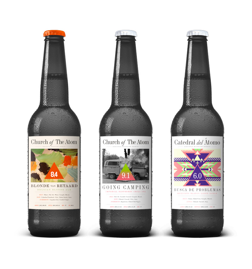
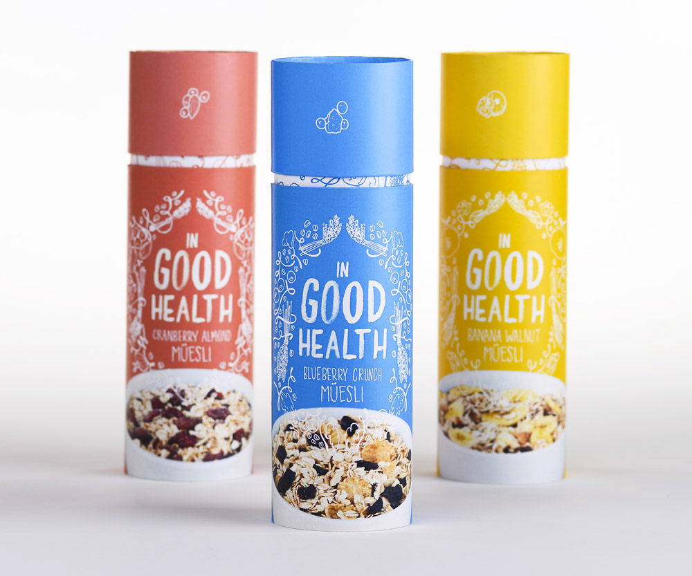
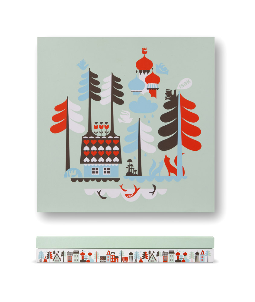
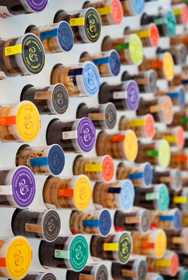
typography: both digital and hand-rendered (really interested in type design), experimentations within Graphic Design (for example use of different materials and processes), printing and screen-printing, alternative and different packaging ideas/outcomes, creative/strong concepts behind the designs
Who are your favourite designers/design studios?
Jessica Hische, Craig Ward, Teagen White, Alberto Seveso
What are your favourite design blogs?
Behance, Lovely Packaging, Design Seeds, Jessica Hische's website
What 5 things do you want to be?
typographer, successful designer, confident with myself when presenting work, original
What 5 things do you think you need to do to be this?
practice, experience, organise myself, research into more designers and studios
Research Into The Areas of Design That I Enjoy:


